The short answer
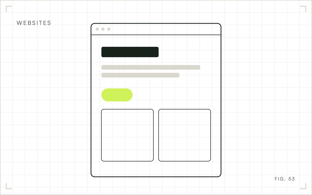
A homepage needs a clear headline, a plain value proposition, one main call to action, visible proof such as reviews, simple navigation, a services overview and contact details. It should tell a first time visitor what you offer and what to do next within a few seconds.
Visitors rarely read a homepage. They scan it for a signal that the business is real and relevant. That scan takes seconds, which is why a homepage built around what you want to say tends to underperform one built around what a stranger needs to know first.
Who lands on the homepage
Not everyone lands here first. Search visitors often arrive on an inner page, while people who type your name after hearing about you usually start at the homepage. The landing pages report in your analytics lists how many visits begin here, so you can see how much work this page has to do. The importance of a website guide makes the wider case.
The ten elements, in order
The first seven cover what a visitor takes in during the first scan. The last three support contact, consistency and search.
1. A headline that says what you do
The headline should tell a first time visitor what you offer and who it is for. "Roof repair for Houston homeowners" works. A clever tagline that needs explaining does not. Test it on someone outside your business: if they cannot say what you sell after reading it, rewrite it.
2. A value proposition under it
One or two sentences should say why someone should pick you: what you do and what makes it different. Write it as a benefit to the visitor and save the list of credentials for the about page.
3. One main call to action
Choose the single action you most want, such as "Book a call" or "Get a quote," and make it the most visible button above the fold. Repeat it lower on the page. Other actions can exist, but they should look quieter. The guide to getting more visitors to act covers how to test changes to it.
4. Proof near the call to action
Doubt is highest next to the button, so put your best proof there. Review ratings with a count are the proof to put first. A short testimonial that names a specific problem you solved comes second, with a real name and role. Do not invent or lightly edit quotes. Logos you have permission to use and certifications work as supporting proof further down.
5. Navigation that fits on one line
Keep the main menu to the pages people look for, usually services and contact. Use plain labels: "Services" is clearer than "Solutions." If your menu has twelve items, visitors will not read twelve items.
6. A scannable overview of what you offer
Give each service a heading and one sentence, linking to its own page. Three to six blocks is usually enough. These links also give visitors, and search engines, a clear path to your service pages.
7. A real image or video
Photos of your own team or work are usually more credible than generic stock photos, and they show visitors what to expect. If you use video, make sure it does not slow the page or play sound on its own. The notes on visual hierarchy explain how to guide the eye.
8. Contact details you can find at once
Show a phone number or a short form, and your address if customers visit you or you serve a local area. Keep the name, address and phone number identical everywhere they appear on the site.
9. A header and footer that work on every page
The header carries your logo, which should link back to the homepage, along with the menu and the main button. The footer carries secondary links and policies. Both appear on every page, so they have to work everywhere.
10. Text that says what the page is about
Use one H1 and short descriptive subheadings, with enough real text to explain your services and the area you serve in plain words. Avoid stuffing keywords, because a stiff page does not help visitors or search. The website content plan guide shows how to plan the other pages around it.
What changes by type of business
The ten elements stay the same, but the emphasis moves. A local service business should put the phone number, service area and reviews high on the page, because visitors often want to call. An online store should feature best sellers or categories and a visible search box.
Test the headline on five people
Before you rewrite anything, show the top of the page to five people who do not know your business. Give each of them five seconds, hide the page, and ask what the business sells and who it is for. If three or more answer differently from what you intended, the headline and value proposition need work. The test costs nothing, and it replaces arguments about wording with answers from people who match your visitors.
Repeat it after each change. Keep a short log of the headline you tried and what people said back, so you do not drift back to a wording that already failed.
Check the page on a phone
Open the homepage on your own phone and try two things: read the headline without zooming, and find the phone number. If any of those is awkward, fix it before anything else. Buttons should suit a thumb, and nothing should jump while the page loads. Slow pages cost visitors, and the guide on how to increase website load speed covers the usual causes.
Improving a homepage you already have
Start with measurement. Look in your analytics at where visitors leave and which buttons get clicked. Then change one thing at a time: the headline, the main call to action or where the proof sits. Before paying for a rebuild, find out what a website redesign costs, since a few targeted changes often cost less.
Where to start
Open your homepage next to this list and mark which of the ten are missing or weak. Fix the headline and the main button first, since they affect every visitor, then rewrite the proof near the button. Wait a few weeks before judging the change.
Getting a homepage reviewed
WGM reviews a homepage against these elements and sends back a short list of fixes ordered by likely effect. Our website improvement service makes those changes, and the Houston web design team handles full rebuilds when the structure itself is the problem.
Frequently Asked Questions
What is a homepage?
The homepage is the main page of a website, usually at the root address. It introduces the business and directs visitors to deeper pages. It is often, but not always, the first page a visitor sees.
What is the difference between a homepage and a landing page?
A homepage serves many visitors and points them to different pages. A landing page serves one audience with one goal, often after an ad click, and usually removes navigation. See the guide to landing page improvements.
How much text should a homepage have?
Enough to answer a visitor's first questions and name your services and area. Many business homepages can do that in a few hundred words. Link out to service pages for detail rather than packing everything onto the homepage.