The short answer
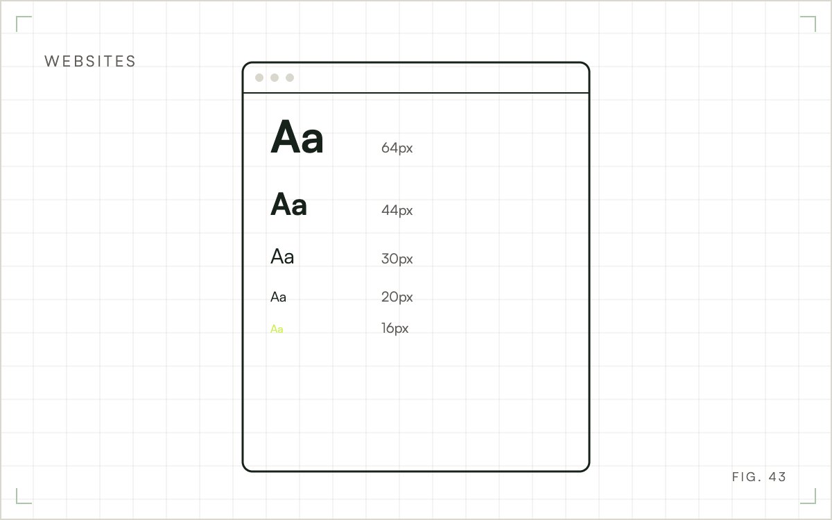
The standard website font size for body text is 16 pixels, the browser default, and 16 to 18 pixels works for most sites. Scale headings up from there, keep buttons at 16 pixels or more and keep captions at 14 pixels or more. Set line height near 1.5 and test on a real phone.
Browsers display body text at 16 pixels unless a stylesheet says otherwise, and designers have kept that default as the baseline. Larger sizes were added for long reading, and smaller ones are kept for secondary text. The numbers below are starting points, not a standard from Google or any body of law.
Starting sizes by element
| Element | Desktop | Mobile |
|---|---|---|
| Body text | 16 to 18 px | 16 px |
| Page title (H1) | 36 to 48 px | 28 to 34 px |
| Section heading (H2) | 28 to 32 px | 22 to 26 px |
| Subheading (H3) | 20 to 24 px | 18 to 20 px |
| Button text | 16 to 18 px | 16 to 18 px |
| Captions and fine print | 14 px | 14 px |
Adjust for the typeface. Fonts differ in x-height, the height of the lowercase letters. A font with a tall x-height looks larger at 16 pixels than one with a short x-height, so a thin, small-lettered font may need 17 or 18 pixels to read the same.
Headings step up in size so a reader can tell the structure of a page before reading a word. A common pattern is a ratio of about 1.25 between levels, so each heading is a quarter larger than the one below it. Treat that as a way to check your scale for gaps, and adjust by eye.
Keep the number of sizes small. Two or three heading sizes and one body size are enough for most pages, and every extra size makes the page look less deliberate.
Pixels, points, em and rem
Print uses points, and one point is about 1.33 pixels, so 12 points equals 16 pixels. Websites use CSS units instead.
A pixel is a fixed size and easy to reason about. A rem is relative to the root font size, normally 16 pixels, so it respects a reader who has changed their browser's default text size. An em is relative to the parent element, which makes nested items compound and easy to get wrong.
Sizing type in rem and letting the layout follow it is a sound default. Developers can find the details in the MDN font-size reference.

What else makes text readable
Size alone does not decide readability. Four other settings change how large the same text feels.
Line height should be about 1.5 times the font size for body text. The accessibility standard WCAG, in success criterion 1.4.12, expects content to keep working when line height is set to at least 1.5.
Line length should stay between roughly 50 and 80 characters. WCAG's strictest level, AAA, asks for no more than 80. Cap the width of text columns instead of letting them stretch across a wide screen.
Contrast matters as much as size. WCAG 1.4.3 requires a contrast ratio of at least 4.5 to 1 for normal text and 3 to 1 for large text. Light gray on white fails even when the type is big.
Weight is the last one. Thin weights look smaller, so use regular or medium for body text.
Sizing for different pages
Long articles
Blog posts and guides are read for long stretches. Use 17 or 18 pixels for body text on desktop, generous line height and a narrow column. The difference between headings and body should be obvious at a glance, which is the idea behind visual hierarchy.
Forms, pricing and checkout
These pages mix text with controls. Keep labels at 14 pixels or more and buttons at 16 or more, with room to tap each one. Form fields matter most on phones, because Safari on iPhone zooms the page when you tap an input whose text is smaller than 16 pixels.
Phones
Keep body text at 16 pixels and scale headings down so they do not wrap onto five lines. Never rely on the visitor to zoom.
Does it affect search rankings?
Google publishes no rule that ranks a page by its font size. The effect is indirect. Text that is hard to read changes how visitors behave, and a page that works poorly on a phone is a usability problem Google's mobile guidance cares about. Fix the type for the reader and treat any search benefit as a side effect.
What accessibility standards require
WCAG sets no minimum font size. It requires that people can enlarge text and that the page stays readable when they do.
Success criterion 1.4.4 says users must be able to resize text up to 200 percent without losing content or function. That rules out disabling zoom in the viewport settings. It also means layouts need room for text to grow without overlapping or being cut off.
The W3C explains both resizing text and minimum contrast. Both are cheap to meet when built in from the start and expensive to retrofit.
How to test your type
- Open your top five pages on a real phone and a laptop, and read the first paragraph without zooming.
- Set browser zoom to 200 percent and look for overlap or clipped text.
- Run a contrast check on body text, link color and buttons.
- Ask someone outside your team to read a page aloud while you watch where they squint.
- Check forms and pricing pages on a small Android phone as well as an iPhone.
Where to start
Choose one page that gets steady traffic, set its body text to 16 pixels and read it on a phone. If it feels cramped, move to 17 or 18 pixels. Then check it at 200 percent zoom. Roll the size that passes out to the rest of the site through your global typography settings. Changing one setting once is faster than editing pages one at a time, and it keeps every page consistent.
Getting your type reviewed
Wise Growth Marketing checks type size, line height and contrast on your live pages across real phones and browsers, then changes the theme or stylesheet settings that fail. That work sits under our page improvement service.
Frequently Asked Questions
Is 10 pt font too small for a website?
For body text, yes. Ten points is about 13 pixels, which strains most readers on screen, especially on phones. It can work for captions or legal text. Use 16 pixels or more for paragraphs and keep 14 as the floor for secondary text.
How do I change the font size on my site?
Use the global typography settings in your theme, site editor or page builder, and change the body and heading styles there. Changing sizes paragraph by paragraph creates inconsistency and makes later changes slow. Most platforms also let you set separate sizes for tablet and phone.
Is bigger body text always better?
No. Past about 20 pixels, body text starts pushing content down the page and shortens each line, which can make scanning harder. Larger text suits short intros and callouts. Keep long passages at 16 to 18 pixels and use size to signal importance.
What is the best font size for reading on screen versus print?
They differ because of distance and medium. On screens we start body text at 16 to 18 pixels. Printed documents commonly use 10 to 12 points, which is roughly 13 to 16 pixels. Neither number replaces testing with real readers on the device they use.